Category: Design Inspiration

  • 10 Creative Ways to Use Grids in Your Web Design

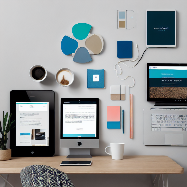
    Grids are the invisible backbone of great web design. They help organize content, create balance, and guide visitors through your site with ease. But grids aren’t just about neat rows and columns – they’re a powerful creative tool that can transform your website from ordinary to extraordinary.

    Whether you’re building a portfolio, online store, or business website, understanding how to use grids creatively will give your designs structure without feeling rigid. Let’s explore ten innovative ways to use grids that will make your website both beautiful and functional.

    Using Asymmetrical Grids for Visual Interest

    Most websites use symmetrical grids where content is evenly balanced on both sides. But asymmetrical grids break this pattern to create dynamic, eye-catching layouts. By shifting elements slightly off-center or varying column widths, you can guide the viewer’s eye through your content in unexpected ways.

    Asymmetrical grids work particularly well for creative portfolios and editorial websites. They add movement and energy to your design while still maintaining underlying structure. The key is to maintain balance through careful placement of visual weight – a large image on one side can be balanced by several smaller elements on the other.

    Creating Overlapping Elements with Grid Systems

    One of the most striking ways to use grids is by allowing elements to overlap intentionally. This technique breaks the traditional “boxes within boxes” approach and creates depth in your design. You can achieve this by using negative space strategically or by layering content in ways that seem to defy the grid structure.

    Overlapping works beautifully for hero sections, testimonials, or feature highlights. When done correctly, it adds sophistication and visual interest without sacrificing usability. Just ensure that overlapping elements don’t interfere with readability or navigation.

    Implementing Modular Grid Layouts

    Modular grids divide your layout into smaller, repeatable units that can be arranged in countless combinations. Think of it like a checkerboard where you can place different sized content blocks – some spanning multiple squares, others fitting perfectly within one.

    This approach is fantastic for content-heavy websites like news sites, blogs, or e-commerce platforms. Modular grids allow you to maintain consistency while accommodating various content types and sizes. You can create visual hierarchy by varying the size of modules based on content importance.

    Using Responsive Grids for Mobile Optimization

    In today’s mobile-first world, responsive grids are essential. These grids automatically adjust and reorganize content based on screen size, ensuring your website looks great on everything from desktop monitors to smartphones.

    Responsive grids use flexible units like percentages or viewport widths instead of fixed pixels. This means your layout adapts fluidly to different devices. For example, a three-column layout on desktop might stack vertically on mobile, but the grid system ensures everything remains properly aligned and spaced.

    Creating Visual Hierarchy with Grid Spacing

    The space between grid elements – known as gutters – is just as important as the elements themselves. Strategic use of spacing can create visual hierarchy, emphasize important content, and improve readability.

    Wider gutters can separate distinct sections or create breathing room around key elements. Narrower gutters can group related items together. By varying gutter widths throughout your design, you can guide visitors through your content in a specific order.

    Implementing Baseline Grids for Typography

    Baseline grids align all your text to a consistent horizontal rhythm, creating a sense of order and professionalism. This technique ensures that all your typography – from headlines to body text – sits on a unified invisible grid.

    Baseline grids are particularly important for content-heavy sites where readability is crucial. They create a subtle but powerful sense of harmony that makes your text more comfortable to read. Many designers use a baseline grid in combination with their main layout grid for comprehensive typographic control.

    Using Grid Systems for Color Blocking

    Color blocking is a design technique where solid colors are used to create distinct visual sections. When combined with grid systems, color blocking becomes even more powerful. You can use your grid to determine where color blocks begin and end, creating a cohesive visual language throughout your site.

    This approach works wonderfully for landing pages, product showcases, or brand-focused websites. Color blocks can highlight important information, create visual separation between sections, or simply add personality to your design.

    Creating Interactive Grid Elements

    Modern web technologies allow us to create grids that respond to user interaction. You can design hover effects that highlight grid cells, create animations that flow along grid lines, or build interactive elements that rearrange based on user behavior.

    Interactive grids add engagement and delight to your website. For example, portfolio items could expand when clicked, or navigation menus could transform into different layouts. The key is to use interaction purposefully – enhancing rather than distracting from your content.

    Implementing Card-Based Grid Systems

    Card-based layouts organize content into individual containers or “cards” that can be rearranged and reorganized. This flexible grid system is perfect for blogs, product catalogs, or any site with diverse content types.

    Each card can contain images, text, buttons, or other elements, and the grid automatically arranges them in the most space-efficient way. Card-based systems are inherently responsive and work well with various content types, making them incredibly versatile.

    Using Golden Ratio Grids for Natural Proportions

    The golden ratio is a mathematical proportion found in nature that many designers believe creates the most aesthetically pleasing compositions. Golden ratio grids use this 1:1.618 proportion to create layouts that feel naturally balanced and harmonious.

    This approach is particularly effective for portfolio sites, photography galleries, or any design where visual appeal is paramount. Golden ratio grids can guide everything from overall layout proportions to the sizing of individual elements.

    Frequently Asked Questions

    What is a grid system in web design?

    A grid system is a framework of intersecting horizontal and vertical lines that helps organize content on a webpage. It provides structure for placing elements consistently and creates visual harmony throughout your design.

    Why are grids important for responsive design?

    Grids are crucial for responsive design because they provide a flexible foundation that adapts to different screen sizes. They ensure content remains properly aligned and proportioned whether viewed on a phone, tablet, or desktop computer.

    How do I choose the right grid system for my website?

    Consider your content type, design goals, and target audience. Content-heavy sites might benefit from modular or card-based grids, while creative portfolios might use asymmetrical or golden ratio grids. Start with simple grid systems and experiment as you gain experience.

    Can I break grid rules in my design?

    Absolutely! Understanding grid systems gives you the knowledge to break rules intentionally and creatively. Many successful designs deliberately break grid conventions to create unique visual effects or emphasize specific content.

    How do grids affect website loading speed?

    Well-implemented grid systems can actually improve loading speed by providing a clear structure for browsers to render. However, overly complex grid systems with many calculations might slightly impact performance. Always test your site’s speed after implementing new grid layouts.

    Conclusion

    Grids are far more than just a technical framework – they’re a creative tool that can elevate your web design to new heights. From asymmetrical layouts to responsive systems, the possibilities are endless. The key is understanding the fundamentals and then experimenting with different approaches to find what works best for your specific project.

    Remember that great grid design is about finding the balance between structure and creativity. Start with solid grid foundations, then don’t be afraid to push boundaries and try new things. Your visitors will appreciate the thoughtfulness and professionalism that well-designed grids bring to your website.

    Whether you’re just starting out or looking to refine your skills, mastering grid systems will give you the confidence to create beautiful, functional websites that stand out in today’s digital landscape. Happy designing!

  • How to Create a Cohesive Color Palette for Your Website

    Choosing the right colors for your website can feel overwhelming at first. With millions of color options available, how do you narrow it down to a perfect palette that works together and represents your brand? A cohesive color palette is more than just picking pretty colors—it’s about creating a visual language that guides visitors through your site and leaves a lasting impression.

    When colors work together harmoniously, they create a sense of professionalism and trust. When they clash or feel random, visitors might leave your site without even realizing why they felt uncomfortable. The good news is that creating a cohesive color palette follows a logical process that anyone can learn.

    Let’s explore how to build a color palette that not only looks beautiful but also serves your website’s goals and enhances user experience.

    Understanding Color Theory Basics

    Before diving into specific colors, it helps to understand how colors interact with each other. Color theory provides the foundation for making smart color choices that naturally work well together.

    The color wheel is your best friend here. It shows how colors relate to each other through primary colors (red, blue, yellow), secondary colors (green, orange, purple), and tertiary colors (mixes like red-orange or blue-green). Colors opposite each other on the wheel are called complementary colors, and they create strong contrast when used together.

    Analogous colors sit next to each other on the wheel and create harmonious, calming combinations. Triadic color schemes use three colors evenly spaced around the wheel for vibrant yet balanced looks. Understanding these relationships helps you avoid combinations that clash or feel chaotic.

    Color psychology also plays a role. Blue often conveys trust and professionalism, making it popular for business websites. Green suggests growth and health, perfect for wellness brands. Red creates urgency and excitement, while yellow feels cheerful and optimistic. Consider what emotions you want visitors to feel when they land on your site.

    Start with Your Brand Identity

    Your website colors should reflect who you are as a brand. If you already have a logo or established brand colors, use those as your starting point. If you’re building a brand from scratch, think about your core values and target audience.

    What personality do you want your brand to have? Professional and trustworthy? Creative and playful? Modern and minimalist? Your color choices should support this personality. A law firm website would choose different colors than a children’s toy store, even if both are well-designed.

    Consider your industry standards too. While you don’t have to follow them exactly, understanding what colors work in your field can help you stand out in the right way. A spa might use calming blues and greens, while a tech startup might choose bold, energetic colors to show innovation.

    Write down three to five words that describe your brand personality. These will guide your color choices and help you stay consistent as you build your palette.

    Choose Your Base Color First

    Every great color palette starts with one dominant color that will appear most frequently across your website. This base color sets the overall tone and mood for your entire design.

    Your base color should align with your brand identity and the emotions you want to evoke. If you’re unsure, look at websites you admire in your industry and note what base colors they use. This isn’t about copying—it’s about understanding what works.

    Consider practical factors too. Light colors can make text harder to read, while very dark backgrounds can feel heavy. Medium tones often work best for backgrounds, with lighter and darker variations for accents and text.

    Once you’ve chosen your base color, you’ll build the rest of your palette around it. This color will appear in your headers, navigation bars, and large background areas.

    Build Your Supporting Colors

    With your base color selected, it’s time to choose supporting colors that complement it. A typical website color palette includes 3-5 main colors plus variations in light and dark shades.

    Start by selecting 1-2 accent colors that contrast with your base color. These will draw attention to important elements like buttons, links, and calls to action. If your base color is blue, consider orange or yellow accents for high visibility.

    Add a neutral color for text and backgrounds. Black, white, gray, or beige work well here. These neutrals provide breathing room and make your accent colors pop. They also ensure good readability across your site.

    Consider adding a secondary accent color for variety. This could be a lighter or darker version of your base color, or a completely different hue that still works harmoniously. Use this color sparingly for visual interest.

    Use the 60-30-10 Rule

    A helpful guideline for balancing your colors is the 60-30-10 rule. This means 60% of your design uses your dominant color, 30% uses your secondary color, and 10% uses your accent color.

    For websites, this might translate to: 60% neutral background colors, 30% your base color for headers and main elements, and 10% accent colors for buttons and highlights. This creates visual hierarchy and prevents any single color from overwhelming the design.

    You can adjust these percentages based on your specific needs. A portfolio site might use more accent colors to showcase creativity, while a corporate site might lean heavily on neutrals for professionalism.

    Test Color Combinations for Accessibility

    Color accessibility ensures that all visitors, including those with visual impairments, can use your website effectively. This is crucial for both user experience and legal compliance in many regions.

    Check that your text has sufficient contrast against its background. The Web Content Accessibility Guidelines recommend a contrast ratio of at least 4.5:1 for normal text and 3:1 for large text. Many free tools online can check this for you.

    Don’t rely solely on color to convey information. If you use red to indicate errors, also include text labels or icons. This helps color-blind users understand your content. About 8% of men and 0.5% of women have some form of color vision deficiency.

    Test your color palette in different lighting conditions and on various devices. Colors can appear differently on mobile screens versus desktop monitors, and what looks good in bright daylight might be hard to read in dim lighting.

    Create Color Variations and Shades

    A professional color palette includes light and dark variations of your main colors. These variations add depth and flexibility to your design, allowing you to create visual hierarchy and emphasis.

    For each main color, create 3-5 lighter tints (by adding white) and 3-5 darker shades (by adding black). These variations are essential for hover states, shadows, and subtle background patterns. They also help create separation between different sections of your website.

    When creating variations, maintain the hue’s character. A blue should stay recognizably blue whether it’s very light or very dark. Use consistent steps between each variation so your palette feels organized and intentional.

    Store these color variations in a document or design tool for easy reference as you build your website. Many designers create a simple color guide showing each color’s hex code and intended use.

    Apply Your Palette to Website Elements

    Now that you have your complete color palette, it’s time to apply it strategically across your website. Different elements call for different colors based on their importance and function.

    Your navigation menu typically uses your base color or a dark neutral to ensure visibility. Links often use your primary accent color, changing to a darker shade or your secondary accent on hover. Buttons should use your most vibrant accent color to encourage clicks.

    Text should be highly readable, usually in very dark gray or black on light backgrounds, or very light gray or white on dark backgrounds. Headings can use your base color or a darker variation to create hierarchy.

    Background colors provide separation between sections. Use light variations of your neutrals for main content areas, and your base color or light tints for header and footer sections. This creates a clear visual structure.

    Tools and Resources for Color Selection

    Several excellent tools can help you create and refine your color palette. Adobe Color allows you to explore color harmonies and extract colors from images. Coolors generates beautiful palettes with one click and lets you lock colors you like while randomizing others.

    Color Hunt offers curated color palettes created by designers, perfect for inspiration when you’re stuck. Paletton helps you visualize how colors work together in different harmony rules. These tools often include accessibility checkers too.

    For testing your palette in real website contexts, many design tools like Figma and Sketch have color plugins. You can also use browser extensions that apply your color palette to existing websites, helping you visualize how your colors might look in practice.

    Common Color Palette Mistakes to Avoid

    Even experienced designers sometimes make color mistakes. One common error is using too many colors, which creates visual chaos. Stick to 3-5 main colors plus variations. Another mistake is choosing colors that are too similar in value, making it hard to create visual hierarchy.

    Avoid trendy colors that might look dated quickly unless they truly fit your brand. Classic color combinations tend to age better. Also, don’t forget about cultural meanings—white means purity in Western cultures but mourning in some Eastern cultures.

    Poor contrast is another frequent issue. Light gray text on white backgrounds might look elegant but can be unreadable for many users. Always prioritize readability over pure aesthetics.

    Maintaining Consistency Across Your Site

    Once you’ve chosen your perfect color palette, consistency becomes key. Create a style guide that documents your exact color codes (hex values), where each color should be used, and examples of proper application.

    Share this guide with anyone who works on your website, including developers, content creators, and future designers. This ensures that every page, blog post, and landing page maintains the same visual identity.

    Use CSS variables or a design system to store your colors in one place. This makes it easy to update colors site-wide if needed and ensures consistency across different pages and components.

    Frequently Asked Questions (FAQ)

    #### What’s the ideal number of colors for a website palette?

    Most successful websites use 3-5 main colors plus light and dark variations. This provides enough variety for visual interest while maintaining cohesion. Too few colors can feel boring, while too many create chaos and confusion.

    #### How do I choose colors that work well together?

    Start with color theory principles like complementary, analogous, or triadic relationships. Use the color wheel to find colors that naturally harmonize. Test combinations using online tools, and always check contrast ratios for accessibility.

    #### Should my website colors match my logo exactly?

    Not necessarily. Your logo colors should influence your website palette, but you can adjust them slightly for better web performance. You might use lighter or darker variations, or add complementary colors that enhance your logo without changing it.

    #### How often should I update my website color palette?

    A well-chosen color palette can last for years. Update only when your brand identity changes significantly or when colors start feeling dated. Minor adjustments to shades or accent colors are fine, but avoid complete overhauls unless necessary.

    #### Can I use black and white as my main colors?

    Absolutely. Monochromatic schemes using black, white, and grays can be very sophisticated and timeless. Just ensure you add enough contrast and visual interest through typography, spacing, and imagery to prevent the design from feeling flat.

    #### What if I’m colorblind or have trouble distinguishing colors?

    Use online contrast checkers and accessibility tools that don’t rely on color perception. Focus on value (lightness/darkness) rather than hue. Many successful color palettes work primarily with light and dark variations of a single hue plus one accent color.

    Conclusion

    Creating a cohesive color palette for your website is both an art and a science. By understanding color theory, starting with your brand identity, and following systematic steps, you can build a palette that looks professional and serves your website’s goals.

    Remember that your color choices affect how visitors perceive your brand and interact with your content. Take time to test your palette, check for accessibility, and maintain consistency across all pages. The effort you invest in choosing the right colors will pay off in a website that not only looks beautiful but also converts visitors into customers.

    Start with one color that represents your brand, build supporting colors around it, and use the 60-30-10 rule to create balance. With practice and attention to detail, you’ll develop an eye for color combinations that work beautifully together. Your website visitors—and your bottom line—will thank you.

  • The Secret to Designing a Memorable Logo for Your Brand

    Creating a logo that people remember is like crafting a signature for your brand. It’s the first thing customers see, and it often determines whether they’ll give your business a second glance. A memorable logo isn’t just pretty—it tells your story, builds trust, and sets you apart from competitors. Whether you’re starting fresh or rebranding, understanding what makes a logo stick in people’s minds is essential.

    The best logos are simple, versatile, and meaningful. They work across different sizes and platforms, from tiny social media icons to large storefront signs. Think about the logos you remember most—chances are they’re clean, easy to recognize, and connected to the brand’s identity. In this guide, we’ll explore the secrets behind designing a logo that leaves a lasting impression.

    Understanding the Psychology Behind Memorable Logos

    People process visual information faster than text, and a well-designed logo taps into that. Color, shape, and typography all trigger emotional responses. For example, blue often conveys trust and professionalism, while red can evoke energy or passion. Circular shapes tend to feel friendly and inclusive, whereas sharp angles can suggest innovation or strength.

    The key is to align these elements with your brand’s personality. If you’re a financial advisor, you might choose a solid, serif font with deep blue tones to communicate reliability. A children’s toy company might opt for playful, rounded letters in bright colors. Understanding these psychological cues helps you design a logo that resonates with your target audience.

    Start with Your Brand Story

    Before sketching anything, clarify what your brand stands for. What’s your mission? Who are you trying to reach? What makes you different? Your logo should be a visual representation of these answers. If your brand is about sustainability, incorporating natural shapes or earthy colors can reinforce that message.

    Take time to research your competitors too. You want to stand out, not blend in. Look at what’s common in your industry and find ways to differentiate. Maybe everyone uses green for eco-friendly brands—yours could use a unique shade or combine it with an unexpected accent color. This approach ensures your logo is both relevant and distinctive.

    Simplicity is Your Superpower

    Some of the most iconic logos are incredibly simple. Think of Apple’s apple or Nike’s swoosh. These designs are easy to recognize, reproduce, and remember. When you overcomplicate a logo with too many details or colors, it becomes harder to process and less versatile.

    Aim for a design that works in black and white as well as color. Test it at different sizes—can it still be understood when scaled down to a favicon? If not, simplify. Remove unnecessary elements and focus on the core idea you want to communicate. A simple logo also tends to be more timeless, avoiding the need for frequent redesigns.

    Typography Matters More Than You Think

    If your logo includes text, the font choice is crucial. Typography can convey professionalism, playfulness, tradition, or modernity. Custom lettering can make your logo even more unique, but even a well-chosen standard font can work wonders.

    Pair your typography with your icon or symbol thoughtfully. They should complement each other, not compete. For example, a bold, geometric icon might pair well with a clean, sans-serif font, while a hand-drawn symbol could work with a more casual script. Consistency in style helps create a cohesive brand image.

    Color Choices That Stick

    Color is one of the most memorable aspects of a logo. It can evoke emotions, convey meaning, and make your brand instantly recognizable. However, using too many colors can dilute your message and make the logo harder to reproduce.

    Stick to a limited color palette—often one or two main colors with a neutral accent. Consider how your colors will look in different contexts, such as on screens, in print, or on merchandise. Tools like Adobe Color can help you explore harmonious combinations. Remember, some of the most memorable logos use just one or two colors to great effect.

    Versatility Across Platforms

    A memorable logo works everywhere—from your website header to your business card, from social media profiles to product packaging. This means it needs to be scalable, legible, and adaptable.

    Create versions of your logo for different uses: a horizontal layout for websites, a stacked version for social media, and a simplified icon for small spaces. Test your logo on various backgrounds to ensure it remains clear and impactful. If it loses its punch when placed on a busy image or a dark background, it’s time to refine.

    Originality: Avoiding the Copycat Trap

    It’s tempting to draw inspiration from successful logos, but copying—even unintentionally—can harm your brand. Not only does it make you less memorable, but it can also lead to legal issues. Use mood boards and competitor research to understand trends, but always aim for originality.

    Sketch multiple concepts and get feedback from people outside your industry. Sometimes, what seems unique to you might remind others of something else. Fresh ideas often come from unexpected places, so don’t be afraid to experiment with abstract shapes, negative space, or unconventional color combinations.

    Testing and Refining Your Design

    Once you have a few logo concepts, test them with your target audience. Ask for honest feedback: Is it memorable? Does it reflect your brand? Is it versatile? Use surveys, focus groups, or even social media polls to gather insights.

    Be open to iteration. Rarely does a logo come out perfect on the first try. Refine based on feedback, but stay true to your brand’s core identity. Sometimes, small tweaks—like adjusting the spacing between letters or lightening a color—can make a big difference in how your logo is perceived.

    Bringing It All Together

    Designing a memorable logo is a blend of art and strategy. It requires understanding your brand, your audience, and the principles of good design. By focusing on simplicity, originality, and versatility, you can create a logo that not only looks great but also stands the test of time.

    Remember, your logo is just one part of your brand identity. It should work in harmony with your website design, color scheme, and overall messaging. If you’re looking for more design inspiration, check out our guide on [Why White Space is Your Best Friend in Web Design](https://artlume.cfd/white-space-web-design/) to see how simplicity can elevate your entire brand presence.

    Frequently Asked Questions (FAQ)

    How much should I expect to pay for a professional logo design?

    Logo design costs vary widely, from free online tools to premium agencies charging thousands. For a small business, expect to pay anywhere from $300 to $2,500 for a quality, custom logo. Investing in a professional designer often pays off in the long run, as a memorable logo can boost brand recognition and trust.

    Can I design my own logo, or should I hire a professional?

    If you have design skills and a clear vision, designing your own logo is possible. Tools like Canva or Adobe Illustrator can help. However, a professional designer brings expertise in branding, typography, and color theory, which can make your logo more effective. If budget allows, consider hiring a pro for the best results.

    How do I know if my logo is too similar to others?

    Research your competitors and use online tools like Logo Rank or Looka to check for similarities. Ask for feedback from people unfamiliar with your industry—if they confuse your logo with another brand, it’s time to make changes. Originality is key to standing out.

    What file formats should I request from my designer?

    Request your logo in multiple formats: vector files (like .ai or .eps) for scalability, and high-resolution .png and .jpg for web and print. Also, ask for a transparent background version and a favicon file for your website. Having these formats ensures your logo looks great everywhere.

    How often should I update my logo?

    A well-designed logo can last for years, even decades. However, if your business evolves or your logo starts to look dated, a refresh might be in order. Major rebrands usually happen every 5-10 years, but minor tweaks can keep your logo feeling current without losing brand recognition.

    What’s the biggest mistake people make when designing a logo?

    One of the biggest mistakes is trying to say too much. Overcomplicated logos with too many elements or colors are hard to remember and reproduce. Focus on a single, strong idea that represents your brand, and keep the design clean and simple.

    Conclusion

    A memorable logo is more than just a pretty picture—it’s the face of your brand. By focusing on simplicity, originality, and versatility, you can create a design that resonates with your audience and stands the test of time. Remember to start with your brand story, choose colors and typography thoughtfully, and test your design across different platforms. With these secrets in hand, you’re well on your way to crafting a logo that people will remember and trust. If you’re ready to dive deeper into design, explore our tips on [How to Create a Stunning Hero Section for Your Homepage](https://artlume.cfd/hero-section-design-tips/) to make your entire website as impactful as your new logo.

  • How to Use Icons to Enhance Your Website’s User Experience

    How to Use Icons to Enhance Your Website’s User Experience

    Icons are small but mighty tools in web design. They help guide visitors, explain ideas quickly, and make your site feel polished and easy to use. When chosen and placed thoughtfully, icons can make a big difference in how people interact with your website.

    Think about how often you click on a magnifying glass to search or tap a heart to save something. These tiny images speak a universal language, cutting through words and speeding up understanding. That’s the magic of well-used icons—they reduce confusion and create a smoother journey for your visitors.

    Why Icons Matter in User Experience

    Icons act like visual shortcuts. Instead of reading long explanations, users can instantly recognize what an icon means. This saves time and keeps people engaged. For example, a shopping cart icon instantly tells users where to go to view their items, while a phone icon suggests a way to contact you.

    Good icons also add personality to your site. They can match your brand’s style, whether that’s playful, professional, or modern. This consistency helps build trust and makes your site memorable. Plus, icons can break up large blocks of text, making pages more inviting and easier to scan.

    Choosing the Right Icons for Your Site

    Not all icons are created equal. The best ones are simple, clear, and relevant to your content. Avoid overly complex or trendy designs that might confuse users. Stick to familiar symbols—like a house for home or an envelope for email—so visitors know what to expect.

    It’s also important to keep your icons consistent in style and size. Mixing different icon sets can make your site look messy and unprofessional. Many designers use icon libraries like Font Awesome or Material Icons to ensure a cohesive look.

    Where to Place Icons for Maximum Impact

    Placement is key to making icons effective. Common spots include navigation menus, buttons, and section headers. For example, placing a calendar icon next to an event date helps users spot important information quickly. Similarly, using icons in your footer can guide visitors to social media or contact details.

    Icons also work well in lists or feature sections. Instead of bullet points, try using small icons to represent each item. This not only looks more appealing but also helps users remember the information better.

    Icons and Accessibility: Don’t Forget the Text

    While icons are powerful, they aren’t always self-explanatory. Always pair icons with clear text labels, especially for important actions like “Submit” or “Download.” This helps users who rely on screen readers or those who might not understand a particular icon.

    Also, make sure your icons have enough contrast and are large enough to tap on mobile devices. Small or faint icons can frustrate users and hurt your site’s usability.

    Customizing Icons to Match Your Brand

    Using stock icons is fine, but customizing them can make your site stand out. You can adjust colors, shapes, or even create your own icons to match your brand’s personality. For example, if your brand is playful, you might use rounded, colorful icons. If it’s more corporate, sleek, monochrome icons might be better.

    Custom icons can also help reinforce your message. If you run a gardening site, using plant-themed icons instead of generic ones adds a personal touch and makes your content more relatable.

    Icons in Navigation: Guiding Users Seamlessly

    Navigation is one of the most important places to use icons. A well-designed menu with clear icons helps users find what they need without frustration. For instance, a hamburger menu icon is widely recognized for opening a mobile menu, while a home icon instantly takes users back to the start.

    When designing navigation, keep it simple. Too many icons can overwhelm users. Focus on the most important actions and use icons to highlight them.

    Icons for Visual Hierarchy and Content Organization

    Icons can help organize your content and show what’s most important. For example, using a star icon next to featured products or a checkmark for completed tasks helps users scan the page quickly. This visual hierarchy guides attention and makes your site easier to use.

    You can also use icons to group related content. For instance, a folder icon for documents or a camera icon for photos helps users understand what type of content they’re looking at.

    Icons and Loading Speed: Keep It Light

    While icons are helpful, too many or poorly optimized icons can slow down your site. Use lightweight icon formats like SVG, which load quickly and look sharp on any screen. Avoid using large image files for icons, as they can hurt your site’s performance.

    If you’re using a plugin or theme, check that it doesn’t add unnecessary icon fonts or scripts. Streamlining your icon usage keeps your site fast and user-friendly.

    Frequently Asked Questions (FAQ)

    What are the best icon libraries for websites?

    Popular choices include Font Awesome, Material Icons, and IcoMoon. These libraries offer a wide range of icons that are easy to customize and integrate into your site.

    Should I use icons without text labels?

    It’s best to pair icons with text labels, especially for important actions. This ensures all users understand what the icon means, including those using screen readers.

    Can icons improve my site’s SEO?

    Indirectly, yes. Icons can make your site more user-friendly, which can reduce bounce rates and increase time on site—both positive signals for search engines.

    How do I make sure my icons are accessible?

    Use high-contrast colors, provide text labels, and ensure icons are large enough to tap on mobile devices. Test your site with accessibility tools to catch any issues.

    What file format is best for icons?

    SVG (Scalable Vector Graphics) is ideal because it’s lightweight, scalable, and looks sharp on all devices. Avoid using large PNG or JPEG files for icons.

    Conclusion

    Icons are small design elements with a big impact on user experience. When chosen and used thoughtfully, they guide visitors, clarify content, and add personality to your site. Remember to keep icons simple, consistent, and accessible. Pair them with clear text labels, and always consider your brand’s style. With the right approach, icons can transform your website into a more intuitive and enjoyable place for everyone.

    By focusing on these details, you’ll not only improve usability but also create a more engaging and memorable experience for your visitors. So go ahead—start experimenting with icons and see how they can elevate your website today.

  • 5 Easy Steps to Design a Mobile-Friendly Website That Wows

    5 Easy Steps to Design a Mobile-Friendly Website That Wows

    Designing a website that looks amazing on every device can feel tricky, but it doesn’t have to be. More people browse the internet on their phones than ever before, so making your site mobile-friendly is essential. Whether you’re building a portfolio, an online store, or a blog, these five simple steps will help you create a website that looks great and works smoothly on mobile devices.

    Step 1: Start with a Responsive Framework

    A responsive framework is the foundation of any mobile-friendly website. This means your site automatically adjusts its layout to fit any screen size, from giant desktop monitors to tiny smartphone displays. Popular frameworks like Bootstrap or Foundation come with built-in responsive features, making it much easier to get started.

    When choosing a framework, look for one that offers a grid system, flexible images, and CSS media queries. These tools help ensure your content rearranges itself beautifully on smaller screens. For example, instead of showing three columns of text side by side on a desktop, your site might stack them vertically on a phone for easier reading.

    If you’re using WordPress, many themes are already responsive out of the box. Check the theme documentation or demo to see how it looks on mobile devices. You can also use your browser’s developer tools to preview your site on different screen sizes while you build it.

    Step 2: Simplify Your Navigation

    Navigation is one of the trickiest parts of mobile design. On a small screen, there’s not much room for complicated menus. The best approach is to keep your navigation simple and easy to tap.

    A common solution is the “hamburger menu” — that three-line icon that opens a hidden menu when clicked. This keeps your site clean and uncluttered while still giving users access to all your pages. Make sure your menu items are large enough to tap easily, with plenty of space between them to avoid accidental clicks.

    Consider grouping related pages together and using clear, short labels. Avoid dropdown menus on mobile, as they can be frustrating to use on touchscreens. Instead, link to important pages directly from your homepage or use a footer menu for secondary links.

    Step 3: Optimize Images and Media

    Large images and videos can slow down your website, especially on mobile devices where internet speeds may be slower. Optimizing your media is crucial for a smooth mobile experience.

    Start by resizing your images to the exact dimensions needed for your design. There’s no need to upload a 4000-pixel-wide photo if it will only display at 600 pixels on your site. Use modern image formats like WebP, which offer better compression without losing quality.

    Lazy loading is another powerful technique. This means images only load when they’re about to appear on the screen, rather than all at once. This speeds up your initial page load and saves data for your visitors.

    For videos, consider using a service like YouTube or Vimeo to host your content. This takes the strain off your server and ensures smooth playback on all devices. Always include captions or transcripts for accessibility and to help users who may be browsing without sound.

    Step 4: Design for Touch

    Mobile users interact with your site using their fingers, not a mouse. This means your design needs to be touch-friendly.

    Make buttons and links large enough to tap easily — at least 44×44 pixels is a good rule of thumb. Leave enough space around each interactive element to prevent mis-taps. Avoid using hover effects, since there’s no mouse on a touchscreen.

    Form fields should be easy to fill out on a small screen. Use larger input boxes, clear labels, and helpful placeholder text. If possible, enable features like auto-fill and input masks to make data entry faster and more accurate.

    Also, consider the placement of important elements. Keep key buttons and links within easy reach of a thumb, especially for one-handed use. This is sometimes called the “thumb zone” and is especially important for mobile apps, but it applies to websites too.

    Step 5: Test on Real Devices

    No matter how well you plan, the only way to be sure your site works on mobile is to test it on real devices. Browser simulators and developer tools are helpful, but nothing beats seeing your site on an actual phone or tablet.

    Test your site on different screen sizes, operating systems, and browsers. Pay attention to how fast pages load, how easy it is to navigate, and whether all features work as expected. Ask friends or colleagues to try your site and give feedback — sometimes a fresh pair of eyes will spot issues you missed.

    Use tools like Google’s Mobile-Friendly Test or PageSpeed Insights to get detailed reports on your site’s performance. These tools can highlight specific problems, like text that’s too small to read or links that are too close together.

    Going Beyond the Basics

    Once you’ve mastered the basics, there are plenty of ways to make your mobile site even better. Consider adding features like swipeable image galleries, sticky headers that stay visible as you scroll, or progressive web app (PWA) capabilities for a more app-like experience.

    Accessibility is another important consideration. Make sure your site is usable for people with disabilities by following WCAG guidelines. This includes providing alt text for images, using proper heading structure, and ensuring good color contrast.

    If you’re building an online store, streamline the checkout process for mobile users. Offer guest checkout, auto-fill for addresses, and multiple payment options. Reducing friction at checkout can significantly boost your conversion rates.

    Internal Resources for Further Learning

    If you’re interested in learning more about design and development, check out our article on [Beginner’s Guide to Creating a Responsive WordPress Layout](https://artlume.cfd/responsive-wordpress-layout/) for step-by-step instructions on setting up a mobile-friendly site with WordPress.

    For inspiration, read about how [this indie artist turned sketches into stunning murals](https://artlume.cfd/indie-artist-sketch-murals/) and see how creativity can shine on any screen size.

    You might also enjoy our tips on [minimalist design](https://artlume.cfd/minimalist-design-tips/) to keep your mobile site clean and user-friendly.

    External Resources for Best Practices

    For authoritative guidance on mobile web design, visit the [World Wide Web Consortium (W3C)](https://www.w3.org/) website. They provide comprehensive standards and best practices for building accessible, responsive websites.

    The [Google Developers](https://developers.google.com/web) site offers detailed tutorials and tools for optimizing your site’s performance and mobile experience.

    For insights into user behavior on mobile, the [Pew Research Center](https://www.pewresearch.org/) publishes regular reports on smartphone usage and digital trends.

    Frequently Asked Questions (FAQ)

    What is a responsive website?

    A responsive website automatically adjusts its layout and content to fit the screen size of the device being used. This ensures a good user experience whether someone is browsing on a phone, tablet, or desktop computer.

    Why is mobile-friendly design important?

    More than half of all web traffic now comes from mobile devices. If your site isn’t mobile-friendly, you risk losing visitors, hurting your search engine rankings, and missing out on potential customers or readers.

    How can I test if my website is mobile-friendly?

    You can use tools like Google’s Mobile-Friendly Test or simply view your site on different devices. Pay attention to loading speed, readability, and ease of navigation.

    What are the most common mobile design mistakes?

    Common mistakes include using small text, placing buttons too close together, relying on hover effects, and not optimizing images. These issues can frustrate users and drive them away from your site.

    Do I need a separate mobile website?

    No, it’s best to use a single responsive website that works well on all devices. Maintaining separate sites can be complicated and may hurt your search engine rankings.

    How often should I update my mobile design?

    Web design trends and technology change quickly. It’s a good idea to review your site’s mobile performance at least once a year and make updates as needed to keep up with best practices and user expectations.

    Conclusion

    Creating a mobile-friendly website doesn’t have to be overwhelming. By starting with a responsive framework, simplifying your navigation, optimizing your media, designing for touch, and testing on real devices, you can build a site that looks great and works smoothly for everyone. Remember, the key is to keep things simple, fast, and user-friendly. With these five steps, you’ll be well on your way to designing a mobile experience that wows your visitors and keeps them coming back for more.

  • Why White Space is Your Best Friend in Web Design

    White space, also called negative space, is the empty area around design elements on a webpage. Many beginners think filling every pixel with content makes a site better. That couldn’t be further from the truth. White space gives your design room to breathe and helps visitors focus on what matters most. Think of it like the quiet moments between notes in a song—without them, the music becomes noise.

    When you use white space intentionally, your website instantly feels more professional and easier to use. It’s not wasted space; it’s purposeful breathing room that guides eyes and creates balance. Even major brands like Apple and Google rely heavily on white space to make their products feel premium and approachable.

    The Psychology Behind White Space

    Our brains process information better when it’s organized with clear separation. White space creates visual hierarchy by grouping related items together and separating unrelated ones. When everything is crammed together, nothing stands out, and visitors feel overwhelmed. They might leave your site without reading anything.

    Research shows that proper white space can increase comprehension by almost 20%. That’s because our eyes need breaks between chunks of information. White space acts like paragraph breaks in a book—it gives readers natural stopping points to process what they’ve seen.

    The same principle applies to product photography. When editing photos for your website, leaving space around products helps them stand out. Check out these tips for editing product photos to make items pop against clean backgrounds.

    White Space Improves Readability

    Text without breathing room becomes a wall that scares readers away. Adding margins, padding, and line spacing makes paragraphs inviting instead of intimidating. The ideal line length is about 50-75 characters, and white space helps achieve this sweet spot.

    Headings need space above and below to signal importance. Body text needs margins so it doesn’t feel cramped against images or borders. Even the space between letters (kerning) and lines (leading) affects how easily people read your content.

    Many designers forget about mobile users when planning white space. On small screens, you need even more breathing room since fingers need space to tap buttons accurately. This mobile menu guide shows how proper spacing makes navigation effortless on any device.

    Creating Visual Hierarchy with White Space

    Not everything on your page should compete for attention. White space helps establish what’s most important by giving key elements room to shine. Your headline should have more space than supporting text. Your call-to-action button should stand apart from surrounding content.

    Think of your page like a conversation. You wouldn’t shout everything at once—you’d emphasize important points and pause between thoughts. White space creates those pauses visually. It tells visitors where to look first, second, and third.

    This hierarchy principle works across all design types. Whether you’re creating social media graphics or website layouts, strategic spacing guides the viewer’s journey. The same techniques that make Instagram posts scroll-stopping can improve your entire website’s effectiveness.

    White Space and Brand Perception

    Clean, spacious designs feel more modern and trustworthy. When visitors see thoughtful white space, they assume you’re professional and detail-oriented. Cluttered sites suggest chaos and amateurism, even if the content is excellent.

    Luxury brands understand this perfectly. High-end websites use generous white space to convey exclusivity and quality. The emptiness feels intentional, not lazy. It suggests you have confidence in your message and don’t need to shout to be heard.

    This principle extends to color choices too. Understanding color psychology helps you pair white space with the right palette to evoke specific emotions and build trust with your audience.

    Practical White Space Techniques

    Start with generous margins around your entire layout. Then add padding inside containers so content doesn’t touch edges. Increase line height to at least 1.5 times your font size. Add space between paragraphs and sections.

    Use the “squint test” to check your spacing. Squint at your design until it becomes blurry. Can you still tell which elements are most important? If everything blends together, you need more white space.

    Another trick is the “thumb test” for mobile designs. Can you easily tap buttons with your thumb without hitting adjacent elements? If not, increase the spacing. This simple check prevents frustrating mobile experiences.

    Common White Space Mistakes to Avoid

    The biggest mistake is thinking white space is wasted opportunity. Every empty pixel isn’t a chance to add more content. Sometimes the best design decision is to remove something rather than add it.

    Another error is inconsistent spacing. If one section has 20px margins and another has 40px, your design feels random and unprofessional. Establish a spacing system and stick to it. Maybe you use 8px increments throughout your site.

    Don’t forget about responsive design. What looks spacious on desktop might feel cramped on mobile. Always test your spacing across different screen sizes. What works for a photographer’s portfolio might need adjustment for a blog layout.

    White Space in Different Design Contexts

    E-commerce sites use white space to highlight products and make checkout processes feel simple. Blog layouts use it to make long articles less intimidating. Portfolio sites use it to let artwork breathe and feel special.

    Even in minimalist design, white space is essential. Minimalism isn’t about having few elements—it’s about having the right elements with perfect spacing. That’s why these minimalist design tips emphasize white space as a core principle.

    The same concepts apply to physical spaces too. Sculptors who work with recycled materials often use negative space to create striking contrasts. Their approach to physical space can inspire your digital layouts.

    Measuring White Space Success

    You can’t improve what you don’t measure. Track metrics like time on page, bounce rate, and conversion rates before and after spacing adjustments. Better spacing often leads to visitors staying longer and taking desired actions.

    Use heat mapping tools to see where people click and scroll. If important elements aren’t getting attention, they might be lost in a sea of content. White space can guide users to these conversion points naturally.

    A/B testing different spacing approaches helps you find what works for your specific audience. What converts for a photography site might differ from an e-commerce store. Always test with real users when possible.

    Frequently Asked Questions (FAQ)

    What exactly counts as white space in web design?
    White space includes margins, padding, line spacing, and any empty area around or between elements. It doesn’t have to be literally white—it can be any background color or even a subtle texture, as long as it creates visual separation.

    How much white space is too much?
    There’s no universal rule, but if your content feels disconnected or users have to scroll excessively to find information, you might have too much. The right amount depends on your content type, audience, and goals.

    Does white space affect SEO?
    Indirectly, yes. Better readability and user experience from proper spacing can reduce bounce rates and increase time on site—both positive SEO signals. Plus, mobile-friendly spacing helps with mobile-first indexing.

    Should I use white space differently for mobile vs desktop?
    Absolutely. Mobile users need larger touch targets and more vertical spacing since screens are smaller. What feels spacious on desktop might feel cramped on mobile, so always design responsively.

    Can white space work with colorful designs?
    Yes! White space isn’t about minimalism or monochrome designs. You can have vibrant colors and still use white space effectively. The key is balancing busy areas with calm areas.

    Conclusion

    White space isn’t just an aesthetic choice—it’s a powerful tool that improves usability, builds trust, and guides visitors through your content. By giving your design room to breathe, you create a more professional, effective website that serves your visitors better.

    Remember that white space is active, not passive. Every empty area is a deliberate choice that shapes how people experience your site. Start small by adding margins to your text or increasing line spacing, then gradually apply these principles across your entire design.

    The best websites don’t try to say everything at once. They use white space to say the right things clearly and confidently. Your visitors will thank you with their attention, trust, and business.

  • How to Create a Stunning Hero Section for Your Homepage

    How to Create a Stunning Hero Section for Your Homepage

    Your homepage hero section is the first thing visitors see when they land on your website. It sets the tone for your entire brand and can make or break a visitor’s first impression. A well-designed hero section grabs attention, communicates your message clearly, and encourages users to explore further. In this guide, we’ll walk through everything you need to know to create a stunning hero section that captivates your audience from the very first glance.

    #### Why Your Hero Section Matters

    The hero section is often called the “above the fold” area because it’s the first content visible without scrolling. Studies show that users form an opinion about your website within seconds, and a strong hero section can significantly improve engagement and conversion rates. It’s your digital storefront window, and just like a physical store, you want it to be inviting, clear, and memorable.

    #### Choosing the Right Background

    The background of your hero section is crucial because it sets the visual tone. You can choose from a high-quality image, a video, a gradient, or even an animated graphic. If you opt for an image, make sure it’s relevant to your brand and high resolution. Avoid cluttered or distracting backgrounds that take attention away from your message. For a modern look, consider using a subtle gradient or a blurred background that keeps the focus on your text and call-to-action.

    #### Crafting a Compelling Headline

    Your headline is the star of the hero section. It should be clear, concise, and communicate the main benefit or value proposition of your website. Avoid jargon or overly clever wording that might confuse visitors. Instead, aim for a headline that instantly tells users what you do and why they should care. For example, instead of “Revolutionizing the Industry,” try “Helping You Save Time and Money.”

    #### Writing a Supportive Subheading

    While your headline grabs attention, your subheading provides context and elaborates on your main message. This is where you can briefly explain how you solve a problem or what makes your offer unique. Keep it short and supportive—think of it as the bridge between your headline and your call-to-action.

    #### Designing an Eye-Catching Call-to-Action

    Your call-to-action (CTA) button is what drives users to take the next step, whether that’s signing up, making a purchase, or learning more. Make your CTA stand out with a contrasting color and clear, action-oriented text like “Get Started,” “Join Free,” or “Explore Now.” Position it prominently so it’s easy to find and click.

    #### Selecting the Perfect Color Scheme

    Colors evoke emotions and can influence how users perceive your brand. Choose a color scheme that aligns with your brand identity and creates the right mood. For example, blue often conveys trust and professionalism, while orange can feel energetic and inviting. Make sure your text is readable against the background by using high contrast combinations.

    #### Using Typography to Your Advantage

    Typography plays a huge role in the readability and style of your hero section. Use a bold, easy-to-read font for your headline and a complementary font for your subheading. Keep font sizes large enough to be legible on all devices, and avoid using too many different fonts, which can make your design feel cluttered.

    #### Optimizing for Mobile Devices

    More than half of web traffic comes from mobile devices, so your hero section must look great on small screens. Use responsive design techniques to ensure your text, images, and buttons adjust smoothly to different screen sizes. Test your hero section on various devices to make sure nothing gets cut off or becomes unreadable.

    #### Adding Subtle Animations and Interactions

    Subtle animations can make your hero section more engaging without overwhelming the user. Consider adding a fade-in effect for your text, a gentle slide for your CTA button, or a parallax effect for your background image. Keep animations smooth and purposeful—too much movement can distract from your message.

    #### Ensuring Fast Load Times

    A beautiful hero section won’t matter if it takes too long to load. Optimize your images and videos to reduce file sizes without sacrificing quality. Use modern image formats like WebP and consider lazy loading for below-the-fold content. Fast load times improve user experience and can boost your search engine rankings.

    #### Testing and Iterating

    Once your hero section is live, don’t just set it and forget it. Use tools like Google Analytics and heatmaps to see how users interact with your page. A/B test different headlines, images, and CTAs to find out what resonates most with your audience. Regularly updating your hero section keeps your site fresh and relevant.

    #### Common Mistakes to Avoid

    Avoid overcrowding your hero section with too much text or too many elements. Keep your message focused and your design clean. Don’t use low-quality images or hard-to-read fonts. And never forget to include a clear call-to-action—if users don’t know what to do next, they’re likely to leave.

    #### Integrating Internal Resources

    If you’re looking for more design inspiration, check out our article on [minimalist design tips for a clean website](https://artlume.cfd/minimalist-design-tips/) to keep your hero section uncluttered and effective. For those interested in digital art, our guide on [digital painting tools](https://artlume.cfd/digital-painting-tools/) can help you create stunning visuals for your site.

    #### Frequently Asked Questions (FAQ)

    What is the ideal size for a hero section image?

    The ideal size depends on your design, but a common recommendation is a width of at least 1920 pixels and a height between 600-800 pixels. Always optimize for fast loading.

    Should I use a video or image background?

    Both can be effective. Videos are engaging but can slow down your site if not optimized. Images are simpler and load faster. Choose based on your brand and technical needs.

    How do I make my hero section mobile-friendly?

    Use responsive design, test on multiple devices, and ensure text and buttons are large enough to tap easily. Avoid fixed-width layouts that don’t adapt to smaller screens.

    What’s the best way to write a headline for my hero section?

    Keep it short, clear, and benefit-driven. Focus on what your audience cares about most and avoid jargon or overly clever phrasing.

    Can I change my hero section regularly?

    Absolutely. Updating your hero section with seasonal promotions, new products, or fresh visuals keeps your site dynamic and encourages repeat visits.

    #### Conclusion

    Creating a stunning hero section for your homepage is both an art and a science. By focusing on clear messaging, strong visuals, and user-friendly design, you can make a powerful first impression that draws visitors in and guides them toward action. Remember to keep testing and refining your approach as your brand and audience evolve. With the right hero section, your homepage can become a true gateway to your brand’s story and success.

  • 10 Minimalist Design Tips for a Clean Website

    10 Minimalist Design Tips for a Clean Website

    A clean website isn’t just about looking pretty—it’s about making your visitors feel comfortable, focused, and ready to take action. When you strip away the clutter, what’s left is the heart of your message, and that’s where minimalist design shines. In this article, we’ll walk through ten practical tips to help you create a website that feels calm, clear, and incredibly easy to use.

    1. Start with a Clear Purpose

    Before you even think about colors or fonts, ask yourself: what’s the one thing you want people to do on your site? Whether it’s signing up for a newsletter, making a purchase, or reading your latest blog post, every element on your page should support that goal. If something doesn’t serve that purpose, it probably doesn’t belong. This clarity keeps your design focused and your visitors on track.

    2. Embrace White Space

    White space—sometimes called negative space—isn’t wasted space. It’s actually one of the most powerful tools in minimalist design. By giving your content room to breathe, you make it easier for visitors to absorb information. Studies have shown that ample white space can improve comprehension and make your site feel more open and inviting. Don’t be afraid to let your content stand alone; sometimes, less really is more.

    3. Limit Your Color Palette

    A minimalist website usually sticks to a simple color scheme. Two or three main colors are often enough. Choose one dominant color for backgrounds or large areas, a secondary color for accents, and maybe a highlight color for calls to action. This keeps your design cohesive and prevents visual overload. For more on how colors affect user experience, check out our article on [color psychology in web design](https://artlume.cfd/color-psychology-website-design/).

    4. Choose Typography Wisely

    When you have fewer elements on a page, each one matters more. That’s why your choice of fonts is so important. Stick to one or two easy-to-read typefaces. Use size and weight to create hierarchy—big, bold headings for main topics, and smaller, lighter text for details. Keep line spacing generous so your text is comfortable to read. Remember, clarity is key.

    5. Use High-Quality Images Sparingly

    Photos and graphics can add personality to your site, but in a minimalist design, less is more. Choose images that truly support your message, and make sure they’re high quality. Avoid cluttering your pages with too many visuals—each image should have a reason to be there. For inspiration on how artists use visuals effectively, read about [this digital painter’s dreamy landscapes](https://artlume.cfd/digital-painting-tools/).

    6. Simplify Navigation

    Your menu should be easy to find and even easier to use. Stick to a few main categories, and avoid dropdowns if you can. Clear, simple labels help visitors find what they need quickly. If your site is small, a single-page layout with anchor links can work beautifully. The goal is to make navigation feel effortless.

    7. Focus on Content Hierarchy

    Organize your content so that the most important information stands out. Use headings, subheadings, and bullet points to break up text and guide the eye. Place key messages or calls to action where visitors will see them first. This structure helps people scan your page and find what they need without getting lost.

    8. Optimize for Mobile

    More people than ever are browsing on their phones, so your minimalist design needs to work just as well on small screens. Use responsive design to make sure your layout adjusts smoothly to different devices. Test your site on a phone or tablet to make sure buttons are easy to tap and text is easy to read. For step-by-step guidance, see our [beginner’s guide to responsive WordPress layouts](https://artlume.cfd/responsive-wordpress-layout/).

    9. Prioritize Loading Speed

    A fast website is a must for any design, but it’s especially important for minimalist sites where every element counts. Large images, unnecessary scripts, or complex animations can slow things down. Compress your images, minimize plugins, and use clean, efficient code. A speedy site keeps visitors happy and improves your search engine ranking.

    10. Test and Refine

    Even the best designs can always be improved. Ask friends or colleagues for feedback, and pay attention to how real visitors interact with your site. Use tools like heatmaps or analytics to see where people click and how far they scroll. Don’t be afraid to make small changes—sometimes a tiny tweak can make a big difference.

    Frequently Asked Questions (FAQ)

    What is minimalist web design?
    Minimalist web design focuses on simplicity, using only essential elements to communicate a clear message. It emphasizes white space, limited color palettes, and clean typography to create a calm, focused user experience.

    Why is white space important in minimalist design?
    White space helps reduce visual clutter, making content easier to read and understand. It guides the visitor’s eye and creates a sense of balance and harmony on the page.

    How many colors should I use in a minimalist website?
    Most minimalist designs use two or three main colors. This keeps the look cohesive and prevents overwhelming the visitor with too many visual choices.

    Can minimalist design work for e-commerce sites?
    Absolutely! Many successful online stores use minimalist design to highlight products and make the shopping experience smooth and enjoyable. The key is to focus on product images and clear calls to action.

    What are the best fonts for minimalist websites?
    Sans-serif fonts like Arial, Helvetica, or Open Sans are popular choices because they’re clean and easy to read. Stick to one or two fonts and use size and weight to create contrast.

    How do I make sure my minimalist site is mobile-friendly?
    Use responsive design so your site adapts to different screen sizes. Test your layout on phones and tablets, and make sure buttons and links are easy to tap.

    Is minimalist design good for SEO?
    Yes, minimalist design can improve SEO by making your site faster, easier to navigate, and more user-friendly. These factors all contribute to better search engine rankings.

    Conclusion

    Minimalist design isn’t about stripping away everything until your site is bare—it’s about making intentional choices so every element has a purpose. By focusing on clarity, simplicity, and user experience, you can create a website that’s not only beautiful but also effective. Remember, the best designs are the ones that make life easier for your visitors. Start small, test often, and keep refining until your site feels just right.

  • How to Use Color Psychology in Your Website Design

    Colors do more than make your website look pretty. They speak to your visitors, shape their feelings, and guide their actions. The right colors can make people feel welcome, trust your brand, and even click that buy button. The wrong colors can push visitors away before they read a single word.

    When you understand color psychology, you gain a powerful tool for creating websites that connect with people on a deeper level. This isn’t about picking your favorite colors. It’s about choosing colors that match your message and make your visitors feel exactly how you want them to feel.

    Let’s explore how to use color psychology to create a website that looks amazing and works even better.

    Understanding Basic Color Psychology

    Every color carries its own emotional weight. Blue makes people feel calm and trustworthy. Red creates excitement and urgency. Green connects to nature and health. Yellow brings happiness and energy. Purple suggests luxury and creativity.

    These reactions aren’t random. They come from how our brains process color, our cultural experiences, and even our personal memories. When someone lands on your website, they form an instant impression based on your color choices.

    Think about banks and financial websites. They almost always use blue because it builds trust and suggests stability. Fast food restaurants use red and yellow because those colors make people feel hungry and ready to act quickly. Understanding these connections helps you make smarter design choices.

    Choosing Colors for Your Brand Identity

    Your brand colors should tell your story before anyone reads your content. If you run a yoga studio, soft blues and greens create a peaceful, healthy feeling. If you sell high-end watches, deep blacks and golds suggest luxury and quality.

    Start by writing down three words that describe how you want people to feel when they visit your site. Calm? Excited? Trusted? Professional? These words become your color compass.

    Then look at your competitors. What colors do they use? You might want to stand out with completely different colors, or you might choose similar colors to fit into your industry. There’s no perfect answer, but you need to make the choice on purpose.

    Creating Your Color Palette

    A good website color palette usually includes 3-5 main colors. You need a dominant color for your brand, a secondary color for variety, an accent color for calls to action, a neutral for backgrounds, and maybe a highlight color for special elements.

    Your dominant color should appear in your logo, headers, and main buttons. Your secondary color supports the dominant color without competing with it. Your accent color needs to grab attention for important elements like “Buy Now” buttons or sign-up forms.

    Tools like Adobe Color or Coolors can help you find colors that work well together. But don’t just pick pretty combinations. Make sure your colors match the emotions you want to create.

    Using Color to Guide User Behavior

    Colors can direct your visitors’ eyes around your website. A bright orange button on a blue background naturally draws attention. This is perfect for your most important actions like “Start Free Trial” or “Contact Us.”

    The isolation effect, also called the von Restorff effect, means that anything that stands out gets remembered. If everything on your page is blue and green, a red button will get noticed and clicked. But if everything is already bright and colorful, nothing stands out.

    Use this strategically. Your main call-to-action button should contrast with your background. Navigation links can be more subtle. Error messages might be red to signal problems. Success messages could be green to show everything worked.

    Color Psychology for Different Industries

    Different businesses need different color strategies. Healthcare websites often use blue and green to suggest cleanliness and healing. Beauty brands might use soft pinks and purples for a feminine, luxurious feel. Tech companies often choose blue for trust or orange for innovation.

    E-commerce sites selling children’s toys might use bright, playful colors like yellow and red. A high-end jewelry store would likely use elegant blacks, whites, and golds. A vegan food delivery service might choose earthy greens and browns to suggest natural ingredients.

    Think about your target audience too. Younger people often respond to bold, bright colors. Older audiences might prefer more subdued, professional tones. Men and women sometimes have different color preferences, though this varies widely by individual.

    Accessibility and Color Contrast

    Not everyone sees colors the same way. About 8% of men and 0.5% of women have some form of color blindness. Many older people have trouble distinguishing between similar colors. And anyone can struggle to read text that doesn’t contrast enough with its background.

    Your text needs to stand out clearly from its background. Light gray text on a white background might look elegant, but it’s hard to read. Dark text on a light background works best for most situations.

    There are online tools that check your color contrast ratios. Aim for at least 4.5:1 for normal text and 3:1 for large text. This ensures everyone can read your content comfortably.

    Cultural Considerations in Color Choice

    Colors mean different things in different cultures. In Western countries, white suggests purity and weddings. In some Asian cultures, white is associated with funerals and mourning. Red means good luck in China but can signal danger in Western contexts.

    If your website serves a global audience, research the cultural meanings of your chosen colors. A color that seems perfect in your country might send the wrong message somewhere else.

    Even within cultures, personal experiences affect how people react to colors. Someone who loves the ocean might feel great seeing blue. Someone with a bad experience in a blue room might feel uncomfortable.

    Testing Your Color Choices

    The best way to know if your colors work is to test them. Create two versions of your homepage with different color schemes. Show each version to similar groups of visitors and see which one performs better.

    Maybe the blue version gets more newsletter signups. Maybe the orange version leads to more product purchases. Maybe neither makes a big difference. Testing removes guesswork and gives you real data.

    You can also ask friends or colleagues for feedback. But remember that personal preferences don’t always match what works for your target audience.

    Common Color Psychology Mistakes

    One big mistake is choosing colors just because you like them. Your personal favorite color might not match your brand or appeal to your customers. Another mistake is using too many colors. A rainbow website looks chaotic and unprofessional.

    Some people ignore color psychology completely and just copy what competitors do. While it’s good to know what others in your industry use, you should make conscious choices based on your specific goals.

    Another common error is poor contrast between text and background. Beautiful color combinations that are hard to read hurt your website’s effectiveness. Always prioritize readability over pure aesthetics.

    Advanced Color Techniques

    Once you master basic color psychology, you can use more advanced techniques. Color gradients can add depth and modernity to your design. Color overlays on images can create mood and maintain brand consistency.

    You can also use color to create visual hierarchy. Make your most important elements the most colorful or contrasting. Let less important elements fade into the background with more neutral tones.

    Consider using color to indicate different sections of your website. Each main category could have its own accent color, helping visitors understand where they are and what to expect.

    Frequently Asked Questions (FAQ)

    What are the best colors for a website?
    There’s no single best color. The right colors depend on your brand, industry, and target audience. Generally, blue builds trust, red creates urgency, and green suggests health or nature. Choose colors that match your message and appeal to your specific visitors.

    How many colors should I use on my website?
    Most effective websites use 3-5 main colors: a dominant color, a secondary color, an accent color, a neutral background color, and sometimes a highlight color. Using too many colors creates visual chaos and confuses visitors.

    Do colors really affect conversion rates?
    Yes, colors can significantly impact conversions. A button color change can increase clicks by 20% or more. But the best color depends on your specific design and audience. Test different colors to find what works for your site.

    What color should my call-to-action buttons be?
    Your CTA buttons should contrast with your background and other elements. If your site is mostly blue, an orange or red button will stand out. The key is making sure the button is noticeable and inviting to click.

    How do I choose colors that work well together?
    Use color wheel principles: complementary colors (opposite on the wheel) create strong contrast, analogous colors (next to each other) create harmony, and triadic colors (evenly spaced) create balance. Tools like Adobe Color can help generate pleasing combinations.

    What about color accessibility for people with vision problems?
    Ensure good contrast between text and background (at least 4.5:1 ratio for normal text). Avoid relying solely on color to convey information. Use patterns, labels, or text alongside color cues so everyone can understand your content.

    Do men and women respond differently to colors?
    Research suggests some general differences, but they’re not absolute. Women often prefer softer colors and can distinguish more shades. Men sometimes prefer brighter colors. However, individual preferences vary widely, so focus on your specific audience.

    How important is color consistency across my website?
    Very important. Consistent colors build brand recognition and create a professional appearance. Use the same colors for similar elements throughout your site. Create a style guide to maintain consistency as your website grows.

    Conclusion

    Color psychology isn’t about following rigid rules. It’s about understanding how colors affect human emotions and behavior, then using that knowledge to make intentional design choices. The colors you choose speak to your visitors before they read a single word.

    Start by defining the feelings you want to create. Research colors that match those emotions. Build a cohesive palette that works for your brand and industry. Test your choices with real users. And always prioritize readability and accessibility.

    Remember that color is just one element of good website design. It works best when combined with clear messaging, intuitive navigation, and quality content. But when you use color psychology effectively, you create a website that not only looks great but also connects with people and drives them to take action.

    Your website colors are your silent salespeople. Make sure they’re saying exactly what you want them to say.