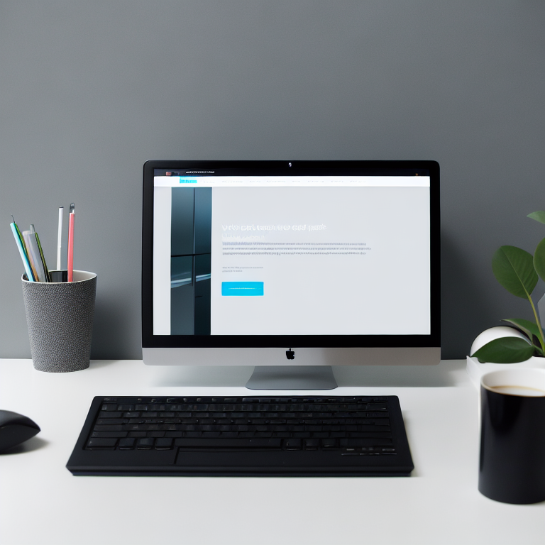
A clean website isn’t just about looking pretty—it’s about making your visitors feel comfortable, focused, and ready to take action. When you strip away the clutter, what’s left is the heart of your message, and that’s where minimalist design shines. In this article, we’ll walk through ten practical tips to help you create a website that feels calm, clear, and incredibly easy to use.
1. Start with a Clear Purpose
Before you even think about colors or fonts, ask yourself: what’s the one thing you want people to do on your site? Whether it’s signing up for a newsletter, making a purchase, or reading your latest blog post, every element on your page should support that goal. If something doesn’t serve that purpose, it probably doesn’t belong. This clarity keeps your design focused and your visitors on track.
2. Embrace White Space
White space—sometimes called negative space—isn’t wasted space. It’s actually one of the most powerful tools in minimalist design. By giving your content room to breathe, you make it easier for visitors to absorb information. Studies have shown that ample white space can improve comprehension and make your site feel more open and inviting. Don’t be afraid to let your content stand alone; sometimes, less really is more.
3. Limit Your Color Palette
A minimalist website usually sticks to a simple color scheme. Two or three main colors are often enough. Choose one dominant color for backgrounds or large areas, a secondary color for accents, and maybe a highlight color for calls to action. This keeps your design cohesive and prevents visual overload. For more on how colors affect user experience, check out our article on [color psychology in web design](https://artlume.cfd/color-psychology-website-design/).
4. Choose Typography Wisely
When you have fewer elements on a page, each one matters more. That’s why your choice of fonts is so important. Stick to one or two easy-to-read typefaces. Use size and weight to create hierarchy—big, bold headings for main topics, and smaller, lighter text for details. Keep line spacing generous so your text is comfortable to read. Remember, clarity is key.
5. Use High-Quality Images Sparingly
Photos and graphics can add personality to your site, but in a minimalist design, less is more. Choose images that truly support your message, and make sure they’re high quality. Avoid cluttering your pages with too many visuals—each image should have a reason to be there. For inspiration on how artists use visuals effectively, read about [this digital painter’s dreamy landscapes](https://artlume.cfd/digital-painting-tools/).
6. Simplify Navigation
Your menu should be easy to find and even easier to use. Stick to a few main categories, and avoid dropdowns if you can. Clear, simple labels help visitors find what they need quickly. If your site is small, a single-page layout with anchor links can work beautifully. The goal is to make navigation feel effortless.
7. Focus on Content Hierarchy
Organize your content so that the most important information stands out. Use headings, subheadings, and bullet points to break up text and guide the eye. Place key messages or calls to action where visitors will see them first. This structure helps people scan your page and find what they need without getting lost.
8. Optimize for Mobile
More people than ever are browsing on their phones, so your minimalist design needs to work just as well on small screens. Use responsive design to make sure your layout adjusts smoothly to different devices. Test your site on a phone or tablet to make sure buttons are easy to tap and text is easy to read. For step-by-step guidance, see our [beginner’s guide to responsive WordPress layouts](https://artlume.cfd/responsive-wordpress-layout/).
9. Prioritize Loading Speed
A fast website is a must for any design, but it’s especially important for minimalist sites where every element counts. Large images, unnecessary scripts, or complex animations can slow things down. Compress your images, minimize plugins, and use clean, efficient code. A speedy site keeps visitors happy and improves your search engine ranking.
10. Test and Refine
Even the best designs can always be improved. Ask friends or colleagues for feedback, and pay attention to how real visitors interact with your site. Use tools like heatmaps or analytics to see where people click and how far they scroll. Don’t be afraid to make small changes—sometimes a tiny tweak can make a big difference.
Frequently Asked Questions (FAQ)
What is minimalist web design?
Minimalist web design focuses on simplicity, using only essential elements to communicate a clear message. It emphasizes white space, limited color palettes, and clean typography to create a calm, focused user experience.
Why is white space important in minimalist design?
White space helps reduce visual clutter, making content easier to read and understand. It guides the visitor’s eye and creates a sense of balance and harmony on the page.
How many colors should I use in a minimalist website?
Most minimalist designs use two or three main colors. This keeps the look cohesive and prevents overwhelming the visitor with too many visual choices.
Can minimalist design work for e-commerce sites?
Absolutely! Many successful online stores use minimalist design to highlight products and make the shopping experience smooth and enjoyable. The key is to focus on product images and clear calls to action.
What are the best fonts for minimalist websites?
Sans-serif fonts like Arial, Helvetica, or Open Sans are popular choices because they’re clean and easy to read. Stick to one or two fonts and use size and weight to create contrast.
How do I make sure my minimalist site is mobile-friendly?
Use responsive design so your site adapts to different screen sizes. Test your layout on phones and tablets, and make sure buttons and links are easy to tap.
Is minimalist design good for SEO?
Yes, minimalist design can improve SEO by making your site faster, easier to navigate, and more user-friendly. These factors all contribute to better search engine rankings.
Conclusion
Minimalist design isn’t about stripping away everything until your site is bare—it’s about making intentional choices so every element has a purpose. By focusing on clarity, simplicity, and user experience, you can create a website that’s not only beautiful but also effective. Remember, the best designs are the ones that make life easier for your visitors. Start small, test often, and keep refining until your site feels just right.
Leave a Reply